design with a story
Great design tells a story, and every story begins with a spark of inspiration. For me, it’s found in the small moments: a bold idea from a client meeting, a splash of color in the world around me, or a late-night sketch that refuses to stay on the page.
With over 20 years of experience, I’ve learned that design isn’t just about how something looks, it’s about creating work that resonates, evolves, and leaves a lasting impression.
Whether I’m shaping a brand or bringing a personal project to life, every piece carries intention. My role is to translate those ideas into something meaningful, memorable, and built to connect.

logo and website stories
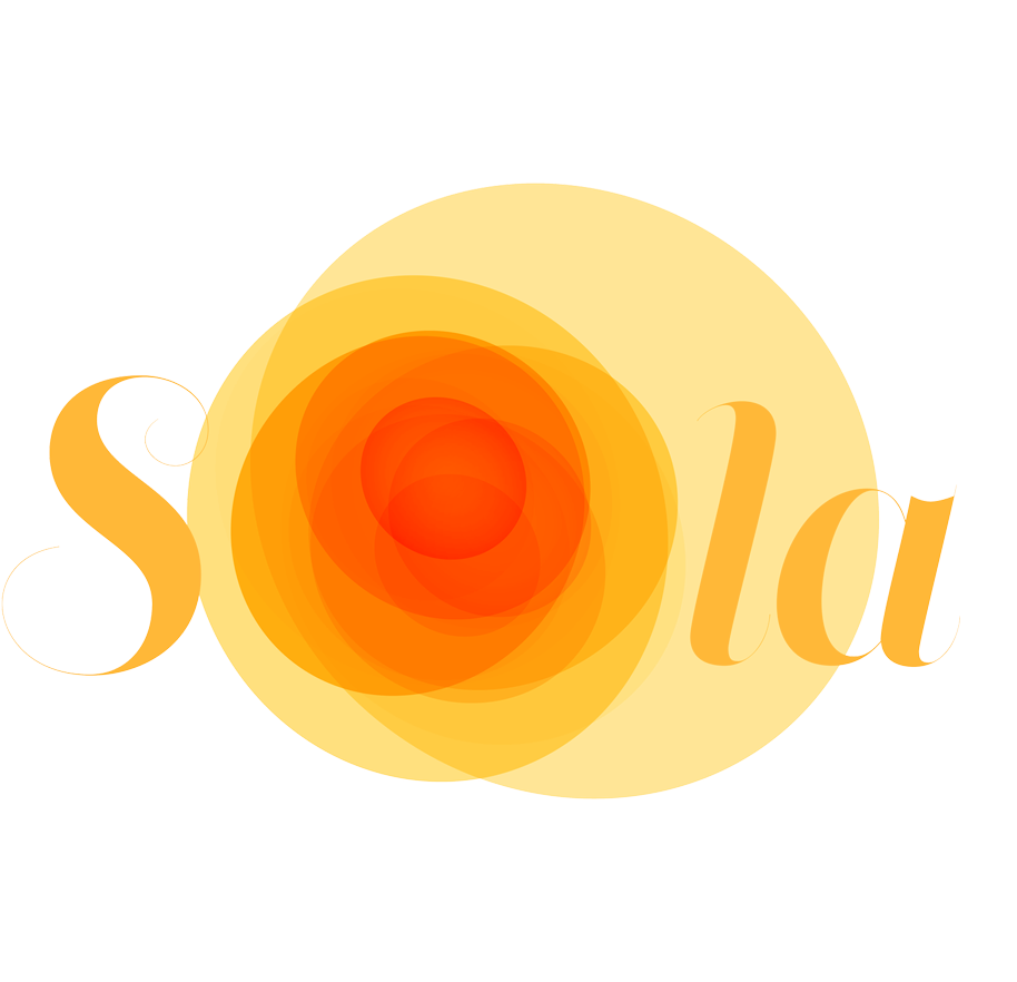
Sola Logo and Website: Dancing in the Sunlight
In a vibrant corner of the city, a group of dancers prepared to take the stage. As they twirled and leaped, their movements painted circles of light in the air, golden and warm like the sun's rays. These dancers, drawn from all corners of Latin America, carried their stories in every step—a testament to their shared heritage and joy.
The logo for SOLA captures this energy. The sun radiates outward from the heart of the 'O,' a glowing celebration of art and culture. Like the dancers’ fluid movements, the script font flows with grace and vitality, a perfect mirror of their vibrant expressions. Each circle of light is a promise: to bring heritage alive through motion and to inspire those who witness its brilliance.

Reya Logo: The Lotus That Blooms
There was once a lotus flower that thrived against all odds. Growing in a quiet corner of the world, it pushed its way through murky waters, standing tall and proud under the sun. It became a symbol of resilience—proof that beauty and strength can bloom even in the toughest of conditions.
This lotus found its way into the Reya logo, where it nestles gently against a lowercase 'r,' merging the natural with the modern. Purple hues were chosen to reflect the compassion and wisdom of healthcare professionals, while the sleek design embraces a contemporary, forward-thinking spirit. Every petal whispers a story of renewal, reminding us that Reya’s mission is rooted in guiding people through life’s most difficult moments to find their strength once more.

HERIF Logo and Website Design: Circles of Innovation
Imagine a ripple spreading across a still pond. It starts small but grows, reaching outward in perfect, overlapping circles. Each circle represents a step forward, a nod to the past while reaching toward a brighter future. This is the story of HERIF—a foundation dedicated to progress in healthcare.
The HERIF logo reflects this journey. Circles surround the bold ‘H,’ symbolizing collaboration, innovation, and the continual flow of ideas. Designed to be simple yet modern, the logo and website offer a message of clarity and purpose to all who see it. It’s not just a design; it’s a reflection of HERIF’s mission to transform healthcare through action, partnership, and vision. Each ripple invites others to join in, creating waves of lasting change
The design showcases the HERIF logomark.

Milt’s Extra Innings - Logo and Website Design
Milt’s Extra Innings was more than a baseball-themed deli—it was a place of purpose. As an offshoot of Milt’s BBQ for the Perplexed, it provided meaningful employment to young adults with special needs, blending great sandwiches with a greater mission.
Its logo, a classic baseball with red stitching and clean sans-serif lettering, reflected both love for the game and an open, welcoming spirit. The website offered a deeper look, featuring memorabilia from the owner’s personal collection—each item telling a story of passion and pride.
Though now closed, Milt’s Extra Innings left a lasting legacy of inclusion, community, and the reminder that even small innings can change the game.

Unidas por Una Infancia Feliz - Logo
The logo for Unidas por una Infancia Feliz embodies the warmth, guidance, and connection that define the relationship between caregivers and children. At the heart of the design, the linear depiction of a woman’s hand (nanny) holding the child’s hand grasping her index finger symbolizes the nurturing bond and trust that shapes a child’s early experiences. The simplicity of the lines reflects the innocence and creativity of a child’s first drawings.
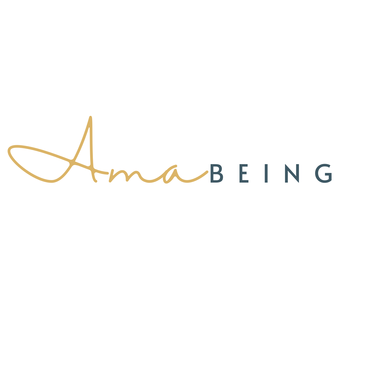
Ama Being- Logo and Website Design
Ama Being is a modern studio for mindful motherhood, where presence meets design.
Rooted in simplicity and intention, it explores the quiet moments that shape both parent and child.
The logo reflects this philosophy: a soft, handwritten “Ama” that feels intimate and human, paired with a structured, minimalist typeface that grounds it. Together, they create a visual language of balance—fluid yet composed, emotional yet refined.
The website carries this aesthetic forward through clean, editorial layouts and thoughtfully curated content. Each page invites a slower pace, offering reflections, creative prompts, and shared experiences designed to reconnect us with what often goes unnoticed.
Ama Being is an invitation—to pause, to notice, and to be.

La Selva Urbana - Logo and Website
The logo for La Selva Urbana captures the beauty of contrast, between structure and spontaneity, urban life and inner stillness.
At the center, a bold, rounded arch in golden orange evokes both a doorway and an abstract 'U', symbolizing urbanidad (urbanity), entry into new spaces, and the pathways we take to seek balance in our lives. Its clean, minimalist lines reflect strength, intention, and grounding—foundations needed in the fast pace of city life.
Curving delicately along the side of the arch is the name La Selva Urbana, echoing motion, rhythm, and the organic unpredictability of a jungle (selva). This spiral-like layout invites the eye to move, mimicking the journey toward mindfulness and mental wellness—rarely linear, often full of twists and growth.
Together, these elements form a quiet yet powerful visual story: one that honors the journey of thriving mentally and emotionally within the modern urban jungle.
-
![]()
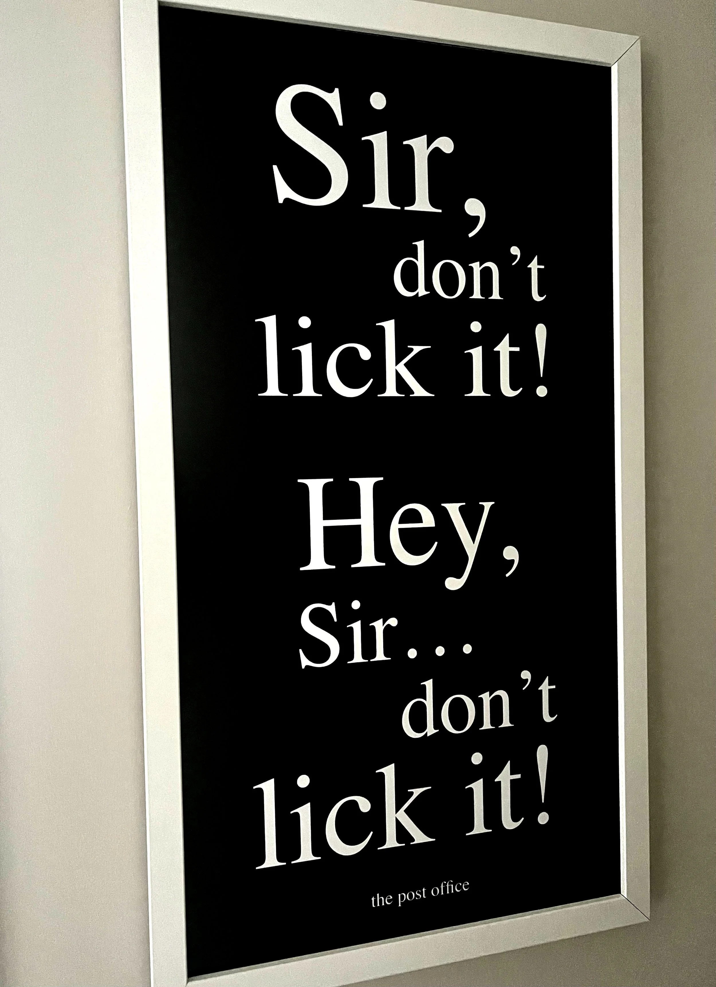
COVID effect
-
![]()
The observer
-
![]()
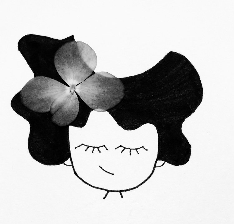
Ella
-
![]()
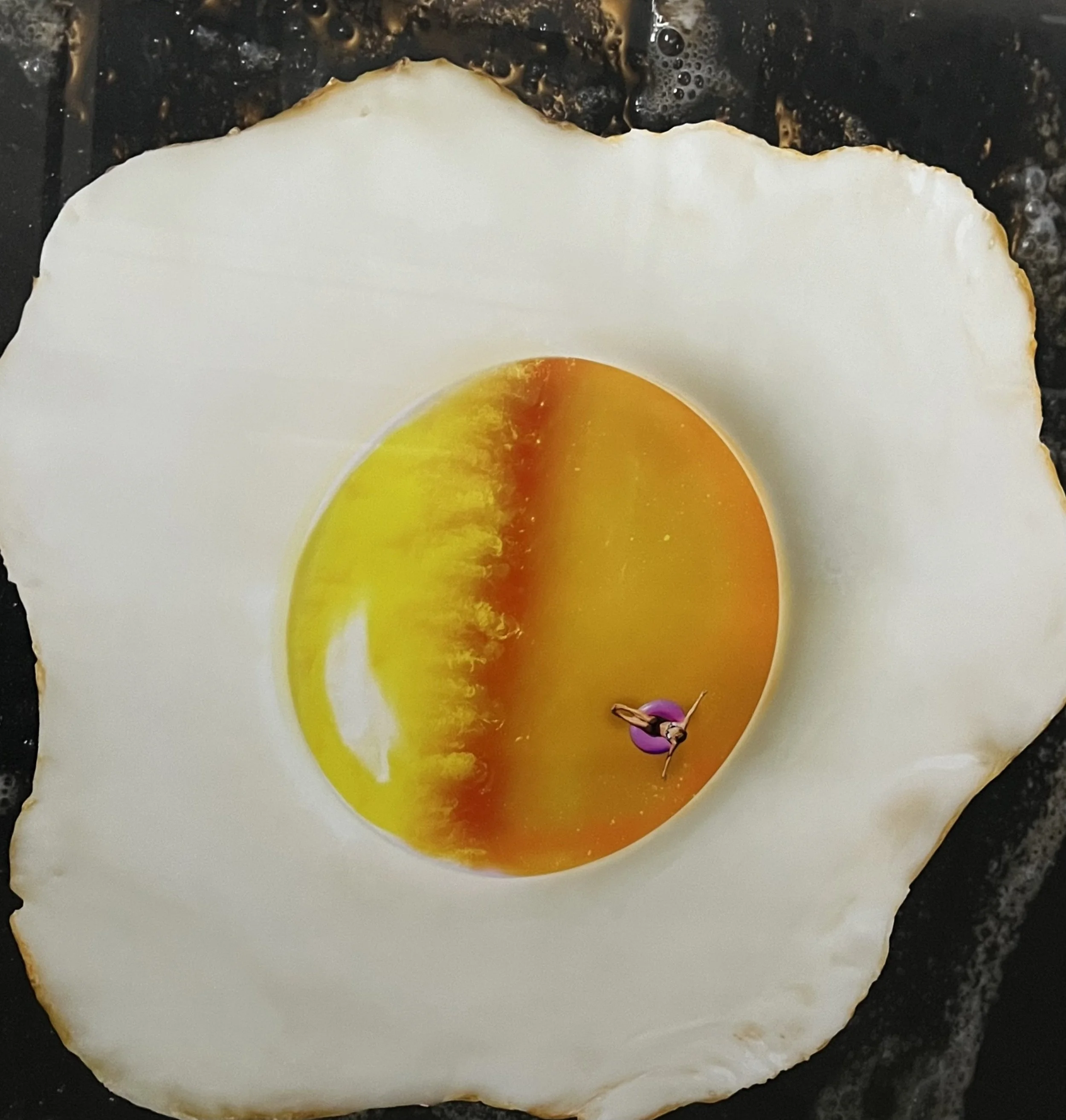
Sunny side up
-
![]()
Joaquin the Jumping Tomato - Children's Story Book